TUTORNEST
EDUCATIONAL APP
4 Weeks
Timeline
UX/UI Designer
My Role
Figma + FigJam
Tools
01
PROJECT OVERVIEW
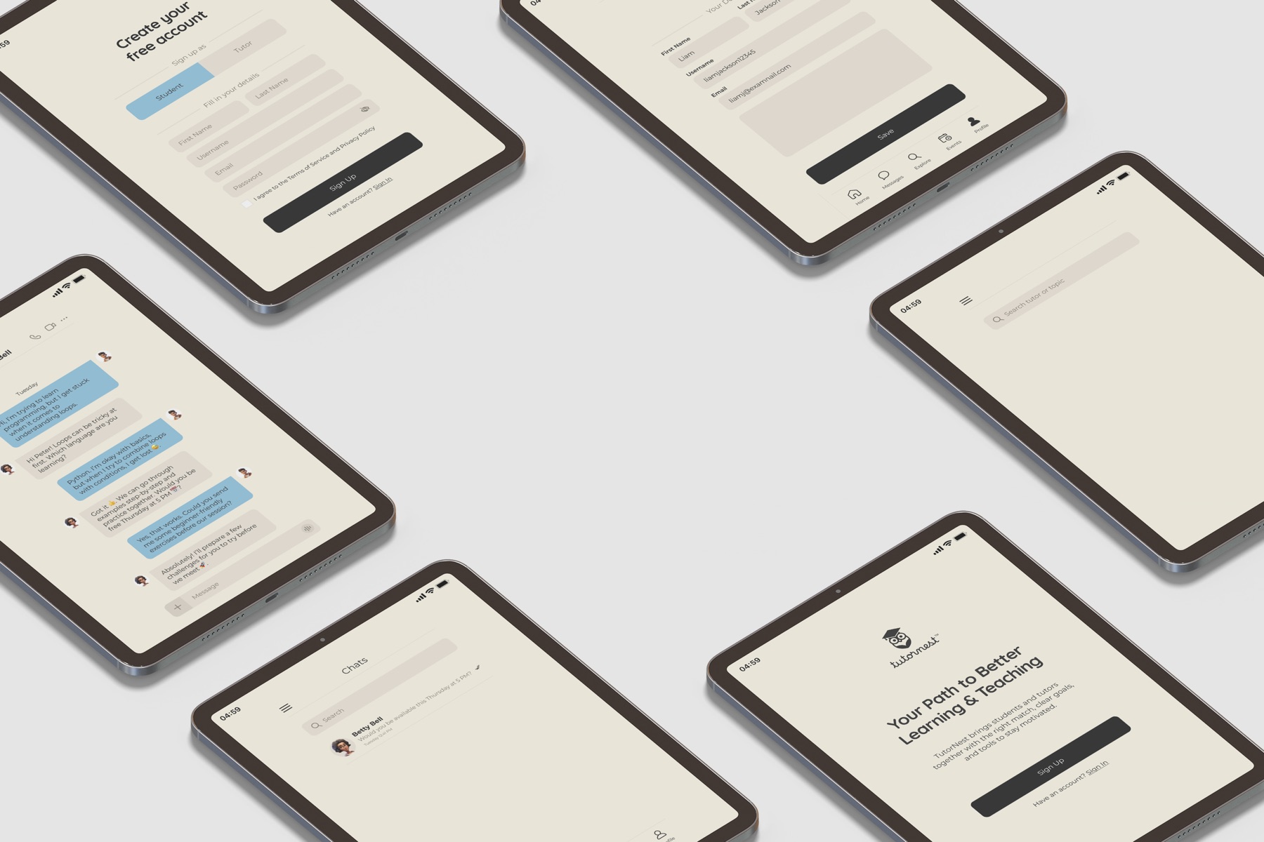
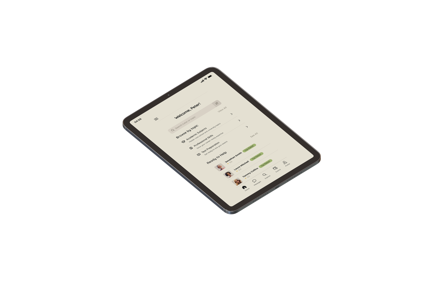
TutorNest is a mobile skill-sharing platform that matches students with instructors for personalized, interactive learning. I worked as a UX/UI designer on a team of four, contributing across the full design process, from research and synthesis through wireframing, prototyping, and usability testing, over a 4-week sprint.
The core challenge: design a two-sided app that works for learners who need structure and motivation, and instructors who need flexibility and tools to engage students effectively.
02
PROBLEM STATEMENT
"The real problem wasn't access to education: it was connection." Existing platforms prioritize content delivery over connection. Students can't find instructors who match their pace, learning style, or availability. Instructors have no tools to engage individual learners. The result: passive lectures, low engagement, and early dropout on both sides.
The goal was to design a platform that solves match quality first, then wraps it in tools that keep both parties engaged, accountable, and motivated to continue.
03
RESEARCH & DISCOVERY
4 interviews + 12 survey respondents. Four insights shaped every design decision that followed.
Engagement
All 12 survey respondents said hands-on, interactive learning is most effective. Passive lectures consistently lead to disengagement.
→ Prioritize interactive formats over content-dump flows
Match Quality
Students feel intimidated asking for help; instructors feel ignored when students disengage. Both stem from poor fit between teaching and learning styles.
→ Make matching style + personality central, not just subject
Motivation
~⅔ of respondents value progress tracking and a reward system. Most preferred a mix of live sessions and pre-made content.
→ Build gamification and progress visibility into the core
Instructor Pain
The biggest teaching challenges were explaining material clearly, managing scheduling, and keeping pace with different learners.
→ Give instructors structured tools: calendar, notes, student dashboards
04
DEFINE
Two archetypes, one platform that had to serve both.
Peter, 23
Learner / Skill-seeker
Goal
Learn new skills to advance his career, with structure and motivation to stay consistent despite a busy schedule.
Frustration
Feels overwhelmed by unorganized content. Nervous about asking questions and afraid of looking unprepared.
Key Need
A matched instructor, organized materials, progress tracking, and a low-intimidation way to connect.

Betty, 46
Instructor / Tutor
Goal
Teach on her own schedule while building genuine connections with students and tracking their progress meaningfully.
Frustration
Online teaching strips away face-to-face connection. It's hard to read student understanding or build trust remotely.
Key Need
Communication tools, scheduling control, and student performance visibility.
05
IDEATION & WIREFRAMES
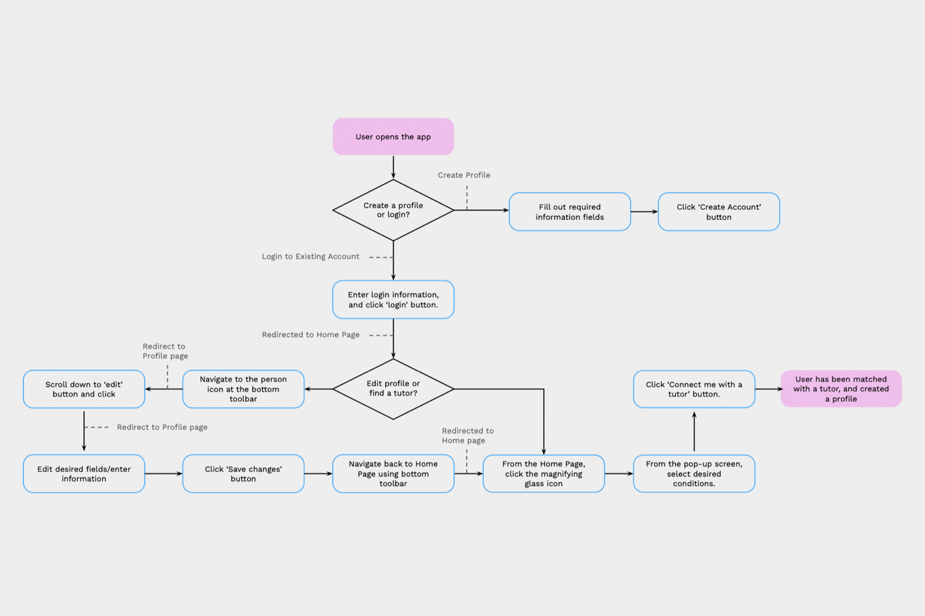
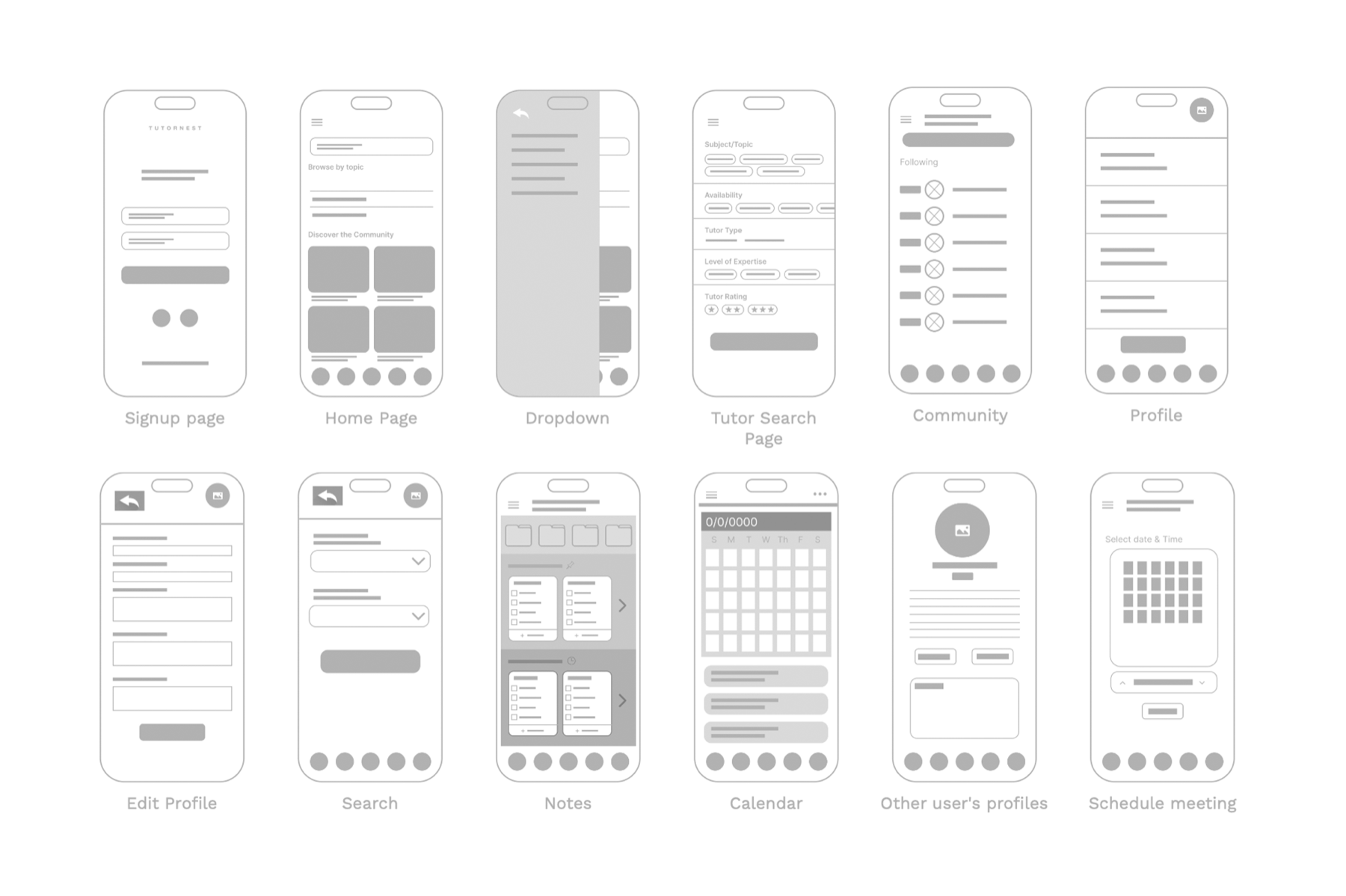
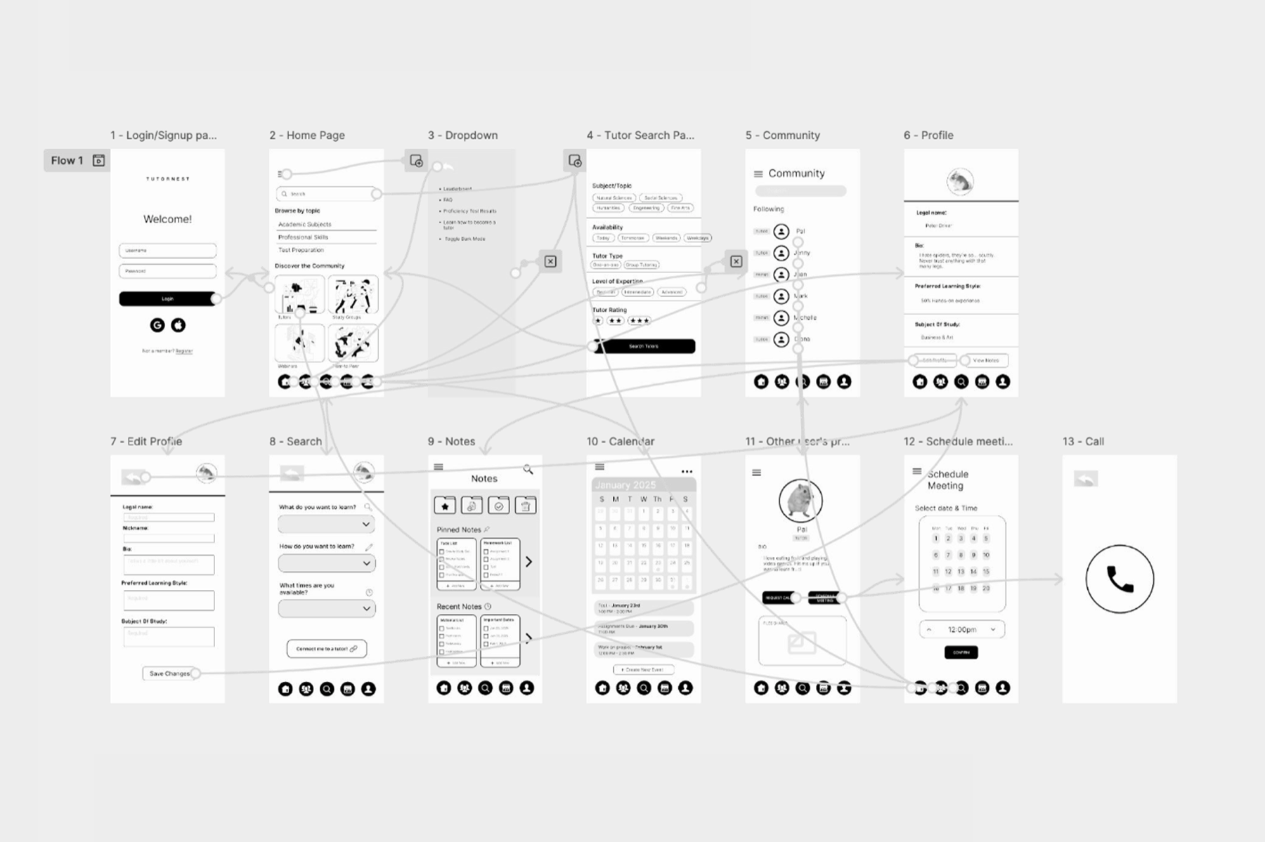
From user flow to 12-screen wireframe set, built around matching style and personality, not just subject.
User Flow
Lo-fi Wireframes
06
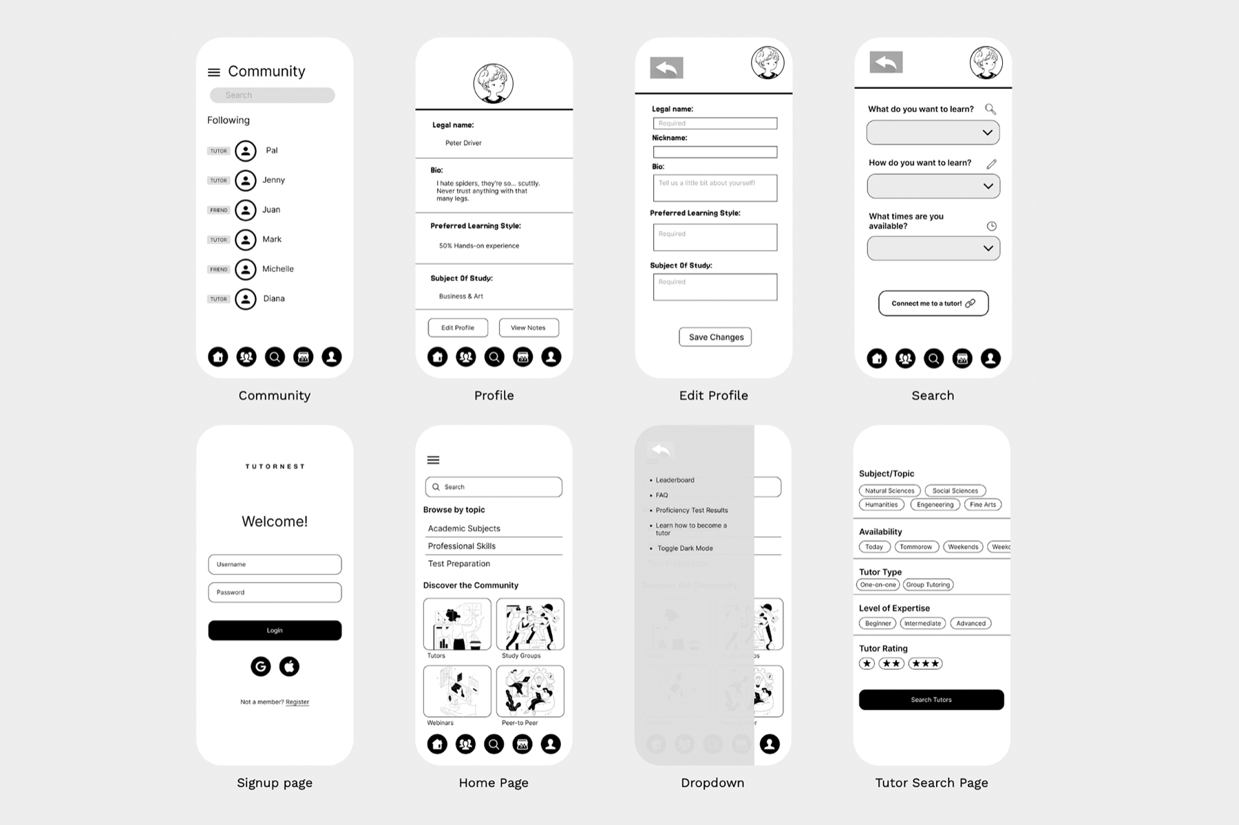
MID FIDELITY WIREFRAMES
The wireframe set iterated into mid-fidelity with real content and subject categories. The version taken into usability testing.
07
TESTING & ITERATIONS
4 moderated usability tests. Each participant completed 5 tasks. Navigation success was high, but four issues emerged consistently.
Icon Clarity
Bottom nav icons weren't immediately recognizable. Users paused or misclicked.
Fix → Add text labels to bottom bar icons.
Section Labeling
Users weren't always sure where they were in the app.
Fix → Stronger page headers, reduced visual clutter per screen.
Information Density
Too much content per screen caused users to feel overwhelmed before completing flows.
Fix → Progressively disclose information; show less until asked.
Search Redundancy
Two entry points to search without clear differentiation between browsing and finding a tutor.
Fix → Distinguish "browse by topic" from "find a tutor" explicitly.
08
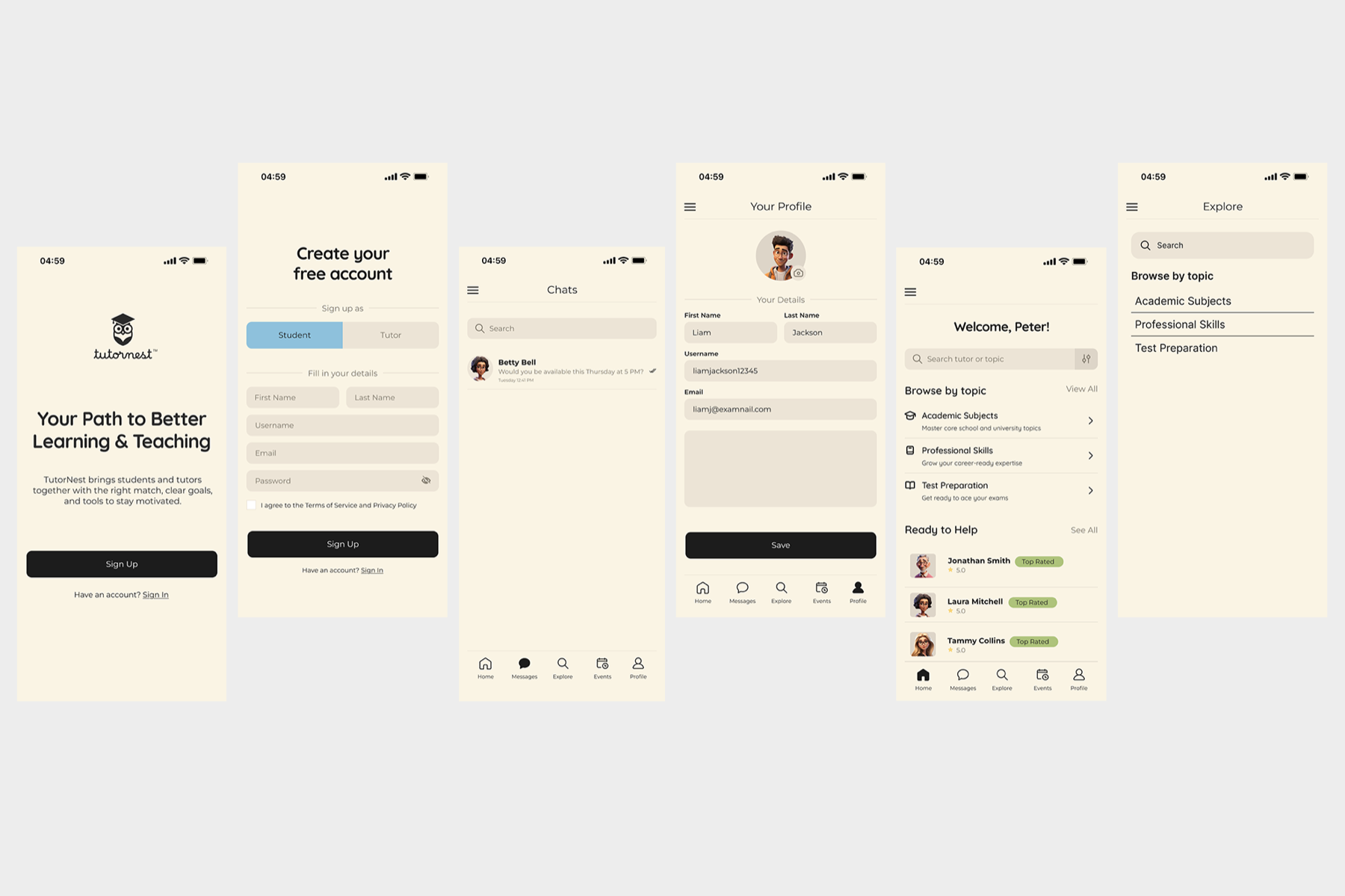
HIGH FIDELITY DESIGN
Final polished screens produced collaboratively with the full team, translating the tested mid-fi wireframes into a branded, shippable experience.
09
REFLECTION & NEXT STEPS
What worked, what didn't, and what the next iteration would look like.
WHAT I'D DO DIFFERENTLY
We tried to solve too much in one sprint. I'd scope the first version to just the matching and messaging flow, validate that it works, then layer in tools. Doing less better would have produced stronger wireframes and cleaner test results.
WHAT'S STILL UNSOLVED
We only tested the student perspective. The instructor experience was never validated with real instructors. That's the higher-risk side and needs its own testing round. Next: tutor onboarding flow, visual design pass, and gamification exploration.