NO DIRT GOLF
Webstore redesign + product customizer
- My Role
- Designer + Developer
- Team
- Solo, with the owner & team
- Outcome
- +201% add-to-cart

01 · Context
A new collection, paid ads on the way, and a store that wasn't built to sell.
No Dirt Golf makes microfiber golf towels built for performance: high quality, designed to turn heads on the course. With a new collection ready to launch and paid ads coming, they needed a store that could actually convert the traffic they were about to drive to it.
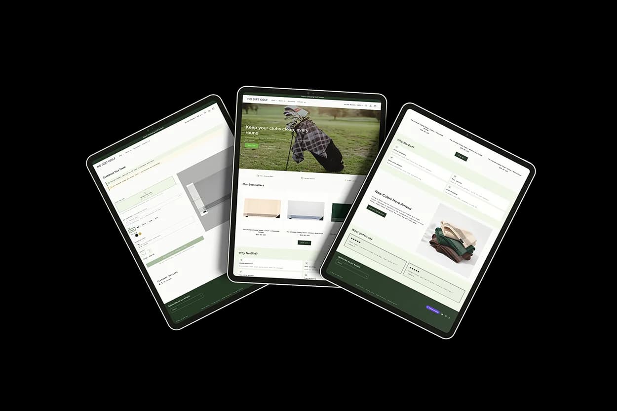
The project had two parts: a full Shopify storefront redesign focused on conversion, and a brand new feature, a custom product configurator that lets customers upload their logo or add custom text right on the product page. I designed and built both, working directly with the owner and their team.
02 · Problem
The design was getting in the way of the product.
The site wasn't failing for one reason. It was failing for several connected ones, and the store's own data showed where: most sessions ended on the homepage, and checkout from cart was fine. The real bottleneck was getting visitors to add anything at all.
Visual clutter
Rotating banners, competing CTAs and too many content blocks. Nothing was clearly the most important thing on the page.
Broken conversion path
The product wasn't prominent above the fold, and there were no trust signals near where purchase decisions get made.
No way to personalize
A product made for branded and gifted use had no customization option, so corporate, gifting and team buyers had no reason to pick it.
03 · Solution
Remove before you add.
The biggest improvements came from cutting sections that didn't serve the purchase, not from adding new ones. Every section had to earn its place or get cut.
One message, one moment
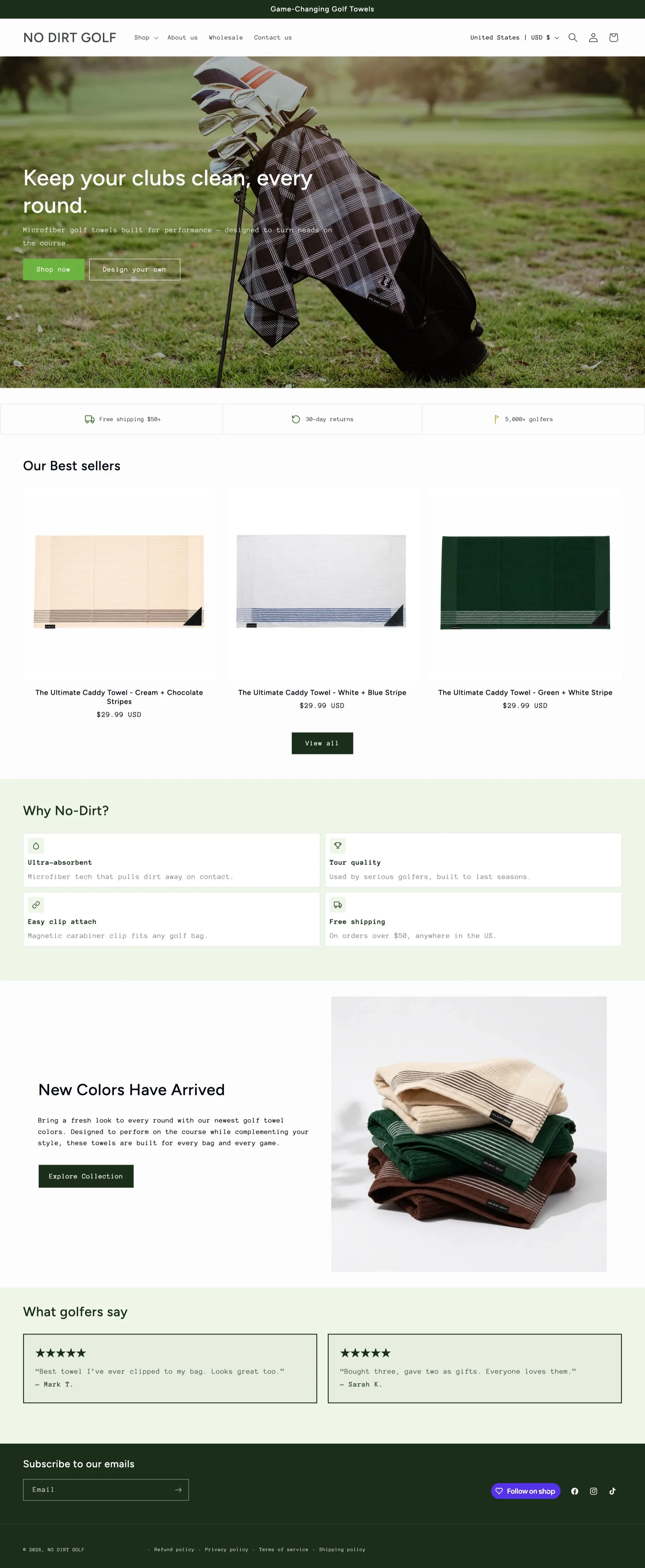
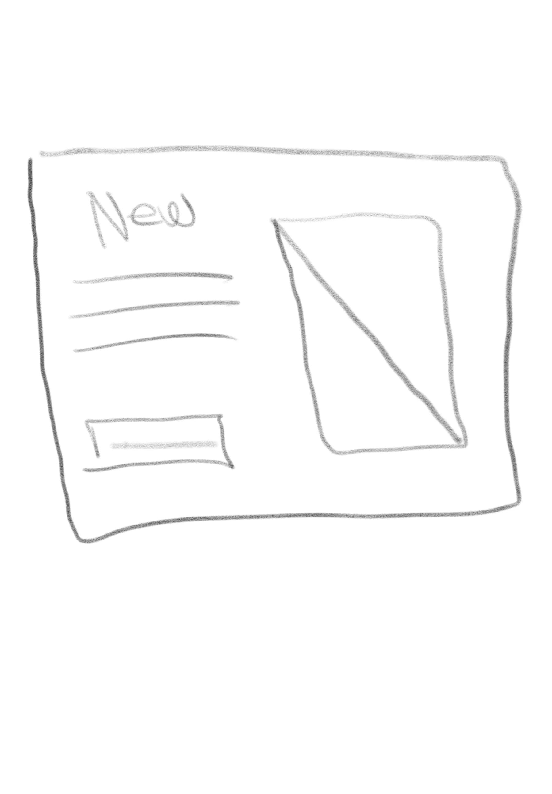
A single full-bleed photo of the product in use and one line: "Keep your clubs clean, every round." Two CTAs: "Shop now" for the standard flow and "Design your own" so the new feature is visible from the first scroll. The other option was keeping the rotating banner so every launch got its own slide. I suggested one message instead, so the first screen does one job well.
Trust signals at the friction point
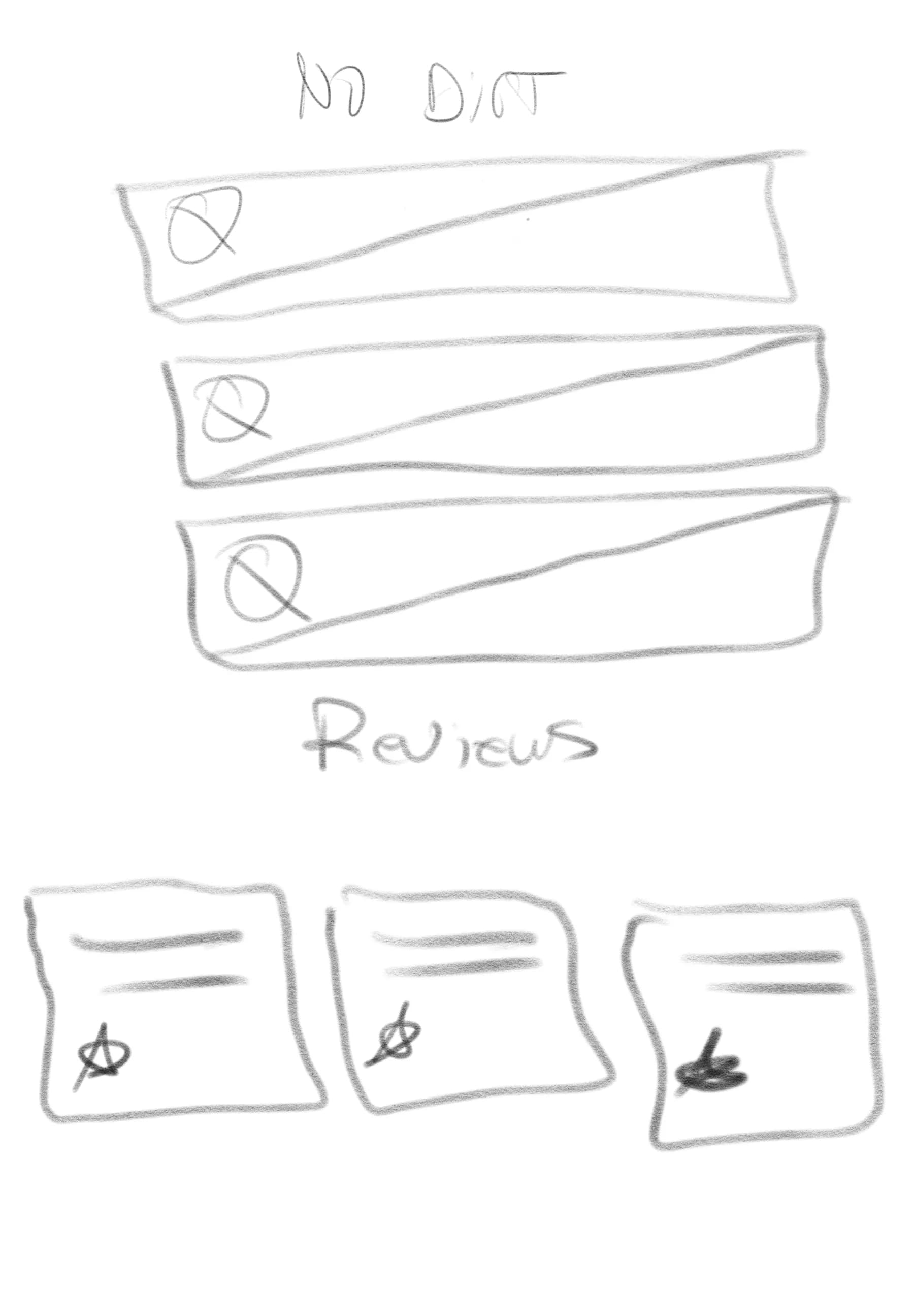
Free shipping over $50, 30-day returns and 5,000+ golfers, placed right below the hero, before the product grid. That's exactly where a first-time visitor hesitates, not down in the footer.
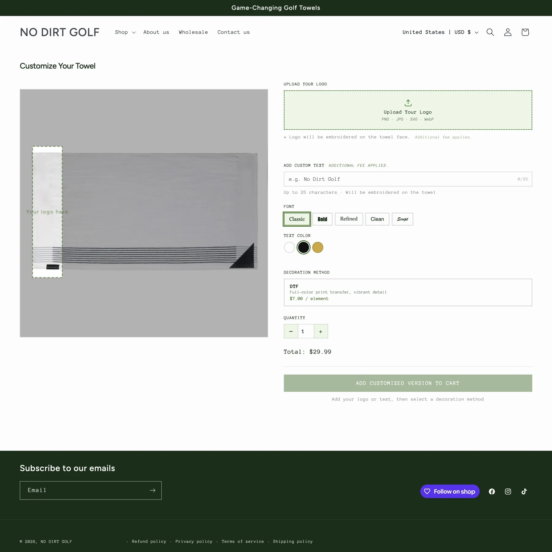
The customizer, built from scratch in Liquid
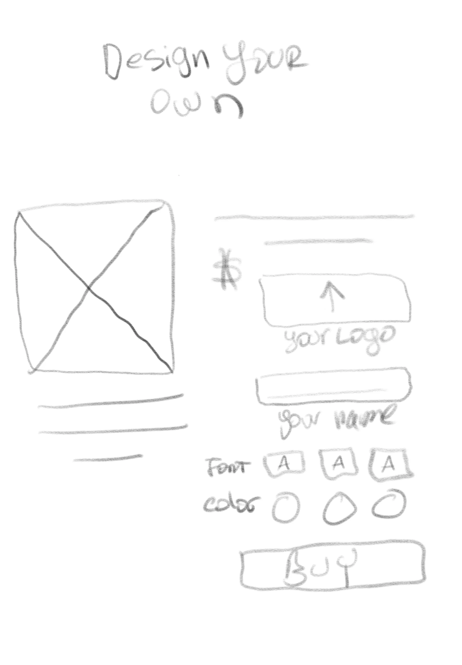
Live preview on the left, controls on the right: logo upload, 25-character text, font, thread color, decoration method with live pricing, and a total that updates before the CTA. Every uploaded asset is tied to the order on the backend. I built it instead of using an app for more control, fewer dependencies and bugs, lower cost, and full ownership. I also made it reusable: the team can change options or add new ones right from the Shopify theme editor, without needing a developer.
04 · Result
Result
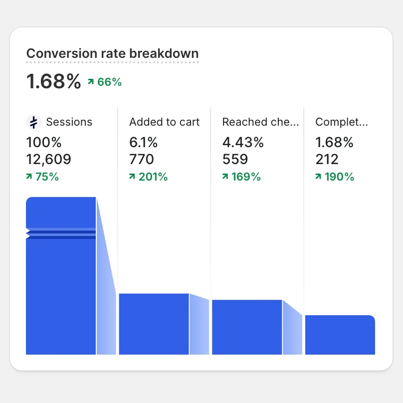
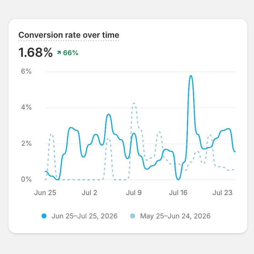
First 30 days after launch vs. the 30 days before. Launched at the same time as the paid ads.
+201%
Added to cart
770
+190%
Completed purchases
212
+66%
Conversion rate
1.68%
+75%
Sessions
12,609
The add-to-cart jump is the number that matters most. Getting a cold visitor to add to cart takes product clarity, trust and motivation all at once, and tripling it in one redesign cycle says the homepage and product presentation worked.
05 · Impact
From a golf towel to a personalizable premium accessory.
The customizer didn't just add a feature, it shifted the product's market position. It opened up gifting, corporate and team use cases the standard product couldn't reach.
Research & direction
No formal interviews. The research came from the store's own data: analytics, abandoned carts, and a competitive audit of where premium golf brands were setting the bar.
Shopify Analytics
High bounce, low time-on-page
Most sessions were ending on the homepage. Visitors weren't scrolling far enough to reach the product grid, signaling the above-the-fold experience wasn't earning attention.
Abandoned Cart Data
Drop-off before checkout was significant
Cart abandonment rates pointed to friction in the purchase path: unclear product value, no trust signals near the buy button, and no reason to act urgently.
Funnel Analysis
Add-to-cart rate was the bottleneck
Checkout completion from cart was reasonable. The real problem was getting visitors to add anything at all. The product page and collection weren't doing enough to convert intent.
Competitive Audit
Premium golf brands were setting a different standard
Clean single-hero layouts, strong product photography, tight value propositions above the fold. No Dirt's store wasn't competing visually with the premium segment it was trying to occupy.
Wireframes
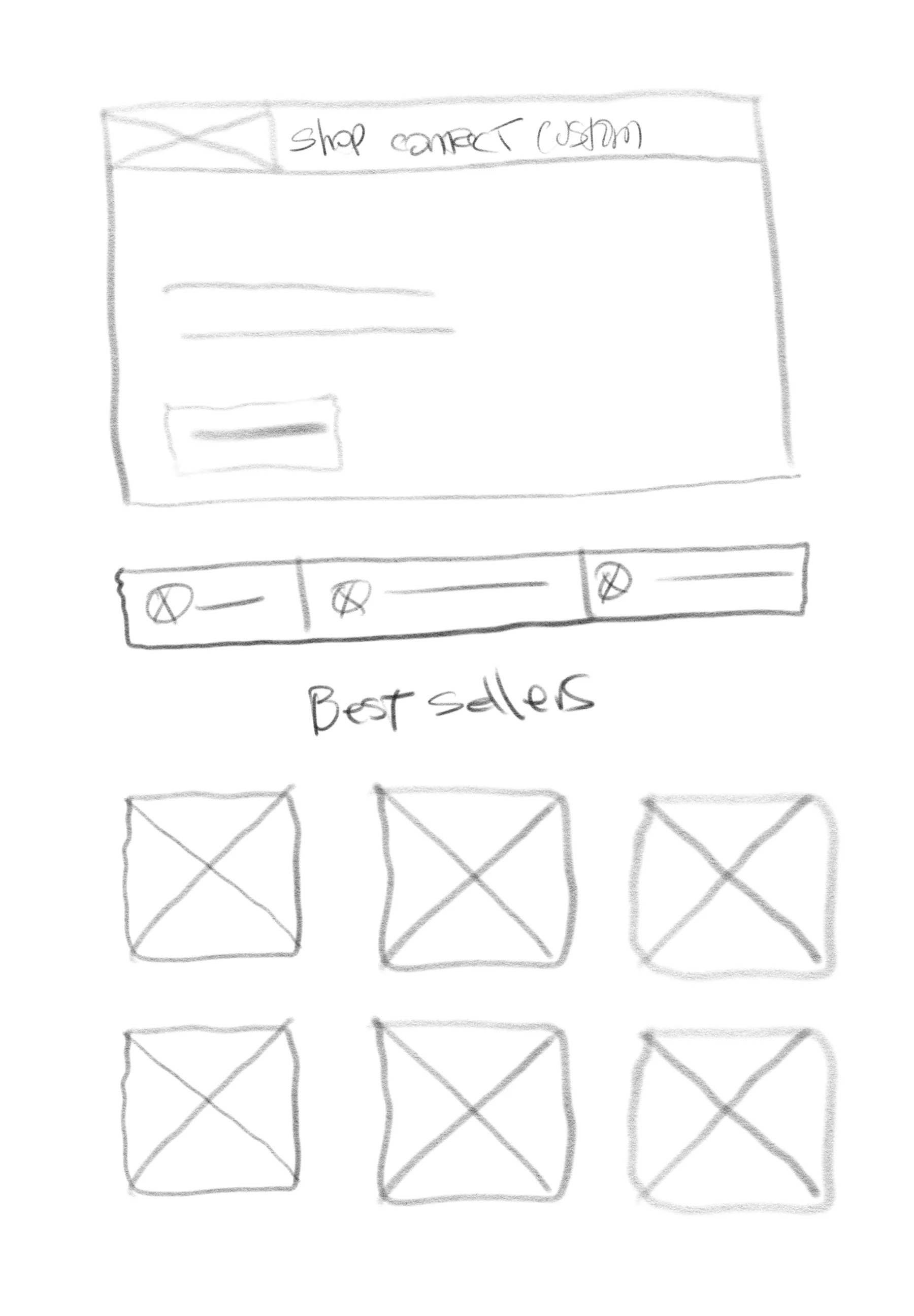
Low-fidelity first: the goal was to decide what the site needed to contain and in what order, before any visual decisions were made.
Analytics
Data from Shopify.
Still ahead
Embroidery decoration method
Add embroidery alongside DTF with visual examples of each: stronger premium feel and higher price points for complex customizations.
Team & bulk ordering flow
The customizer naturally attracts corporate and team buyers. A dedicated bulk ordering experience for that segment is a clear next build.