INTERNATIONAL
PEACE GARDENS
WEBSITE REDESIGN
UX/UI Designer
My Role
Web
Platform
Figma + HTML
Deliverables

01
PROJECT OVERVIEW
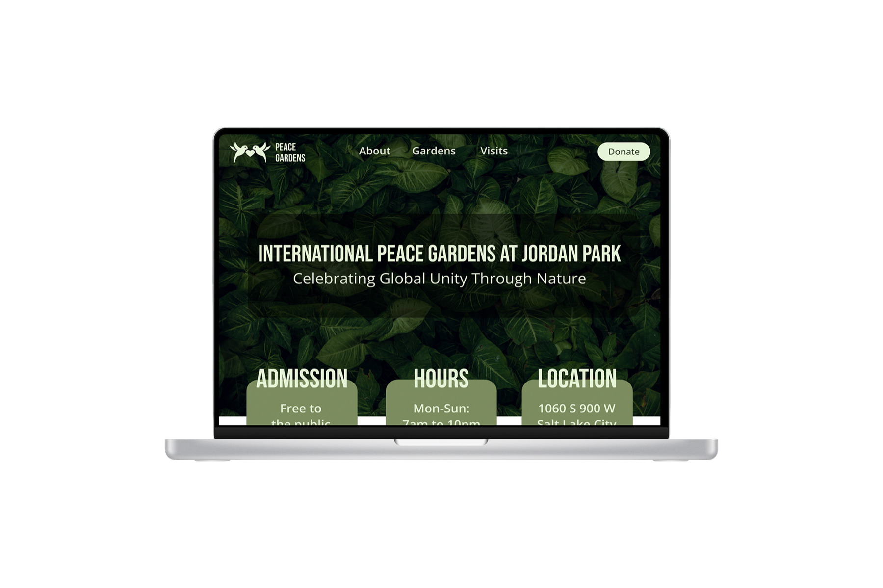
The International Peace Gardens, tucked inside Jordan Park in Salt Lake City, celebrates 26 countries through native plants, cultural sculptures, and heritage design. It's free to visit, deeply community-oriented, and genuinely meaningful; yet most people in the city have never heard of it. A big part of why: the website. I collaborated with a team of three designers to redesign it from the ground up, creating a digital experience that finally matched the spirit of the gardens themselves: inviting, culturally rich, and easy to navigate.
Before
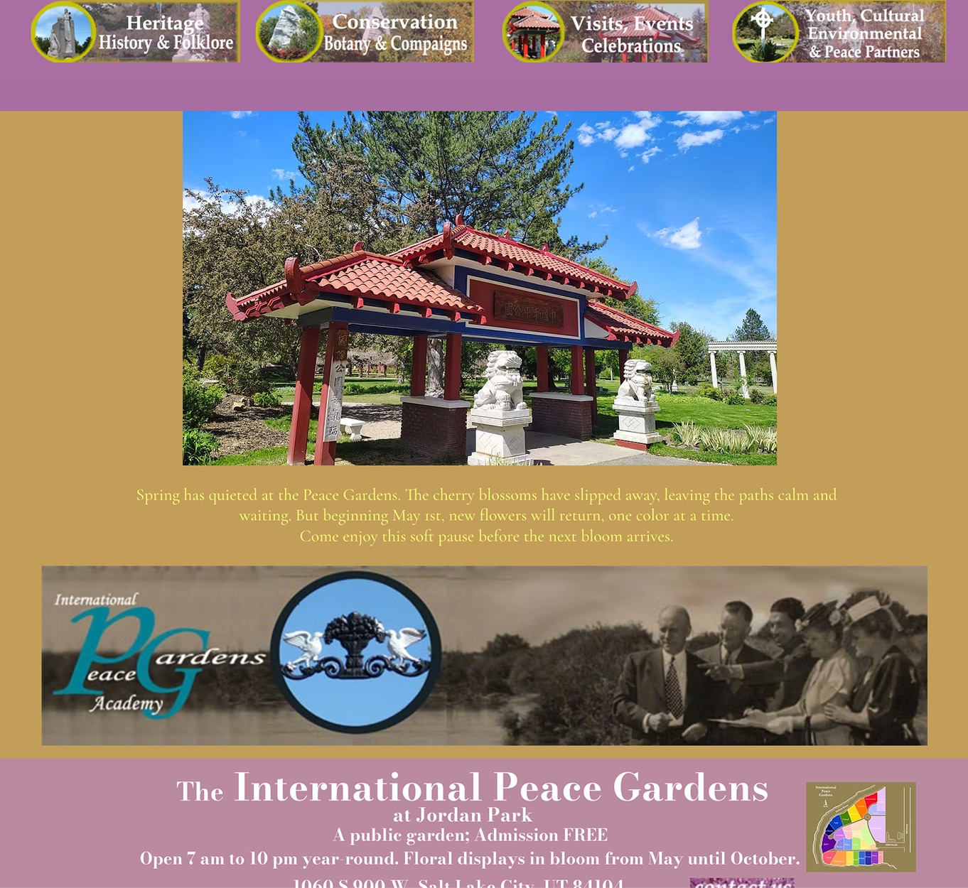
Cluttered homepage, no clear navigation, outdated colors, buried Donate button, poor mobile usability.
After
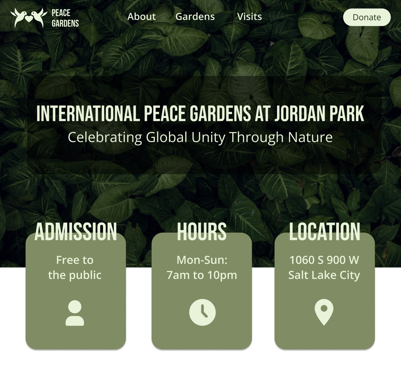
Clean, welcoming site with visible CTAs, interactive map, events calendar, and a Donate flow that works.
02
THE PROBLEM
"A place this culturally rich deserved a digital presence that matched it." The website wasn't just outdated; it was actively turning visitors away. The problems weren't cosmetic; they were structural.
Navigation Failure
No clear navigation system
The site had no consistent nav bar. Users had to guess where to go. Finding hours, directions, or events required multiple clicks with no obvious path.
Brand Identity Gap
No consistent visual identity
Fonts, colors, and layouts had no coherent system. The site felt "thrown together": users described it as a 2000s website with no connection to the gardens' mission.
Content Hierarchy
Wall of text, no visual guidance
The Visit page greeted visitors with dense text and no visual structure. Critical info like hours and directions was buried.
Conversion Failure
The Donate button was invisible
A public garden that depends on donations buried its donation pathway where almost no user found it. The button lacked contrast, prominence, or visual weight.
03
RESEARCH & DISCOVERY
User interviews + competitive analysis. Affinity mapping clustered findings into four themes. The dominant one: usability failures were actively deterring visits.
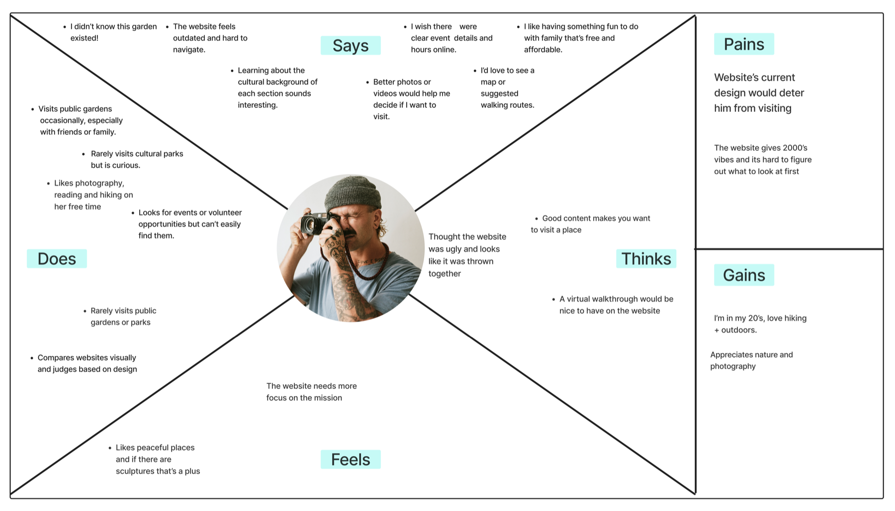
Empathy Map: Paul Abrams
Discovery
Most users didn't know the gardens existed. Multiple interview participants had never heard of the IPG despite living in Salt Lake City. The website was the primary discovery channel, and it was failing.
→ Lead with the story and mission, not just logistics
Visual Trust
Users judge a place by its website design. Low-quality images and outdated design made users assume the gardens were in poor condition. Design quality was being read as a proxy for place quality.
→ High-quality photography is non-negotiable
Orientation
An interactive map was the top requested feature. Users planning visits, especially photographers and first-timers, wanted to understand the layout before arriving.
→ Interactive map as a core page feature, not buried
Cultural Interest
Interest in learning about different cultures was high across all interviews. Users wanted cultural context for each garden section, but couldn't find it.
→ Surface cultural stories as content, not footnotes
04
DEFINE
One persona grounded in real interview data: a culturally curious local who would love the gardens, but whose first contact with the website almost stopped the visit from happening.

Paul Abrams
Age 35 · Salt Lake City · Photographer
What He Wants
Find peaceful, photogenic outdoor spaces. Learn about different cultures. Stay updated on local events. Access detailed visit info without digging.
What Frustrates Him
Outdated websites that look like they haven't been touched since 2005. Hard-to-find event info. Relying on social media because the actual site doesn't help.
His Scenario
Paul discovers the IPG exists and visits the website to plan a photography shoot: wants the best garden sections, a map, and open hours. The current site sends him elsewhere.
How Might We
Design a website where users can easily plan a visit, explore the cultural identity of each garden section, and support the gardens, so a place worth discovering finally has a digital presence worth finding?
Value Proposition
The redesigned IPG website provides a seamless, interactive experience to explore diverse cultures, plan visits, and stay up to date on events, all in one place.
05
INFORMATION ARCHITECTURE
Seven sections, each with sub-pages organized around how visitors actually think about the space — all mapped out before a single screen was designed.
Sitemap: Redesigned Information Architecture
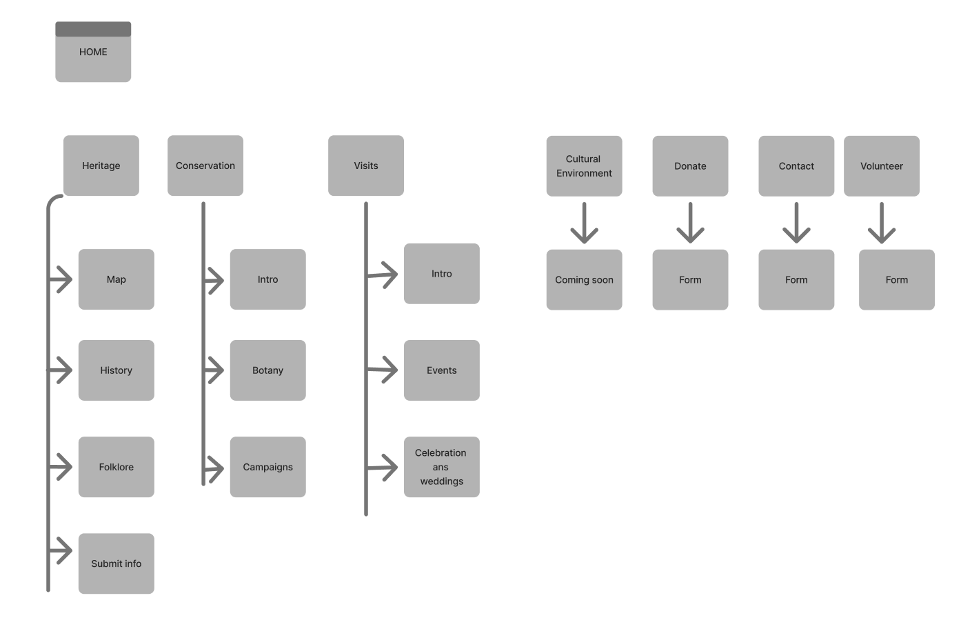
Key structural decision: "Heritage" and "Cultural Environment" were separated intentionally. Heritage covers the history and physical garden sections (with a map); Cultural Environment covers the living culture of each nation's contribution. Interviews showed users wanted both, but in distinct mental contexts.
Three design principles drawn directly from research guided every screen: stunning visuals first, mission-forward copy, and accessible CTAs on every key page.
06
HIGH FIDELITY DESIGN
Four key screens, each solving a specific problem identified in research.
Homepage
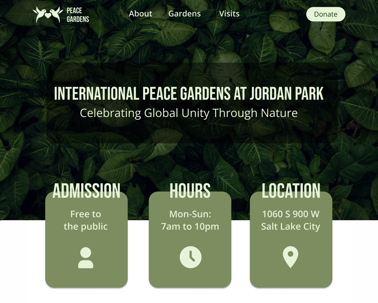
Mission-forward hero, visible Donate in nav
Visit Page
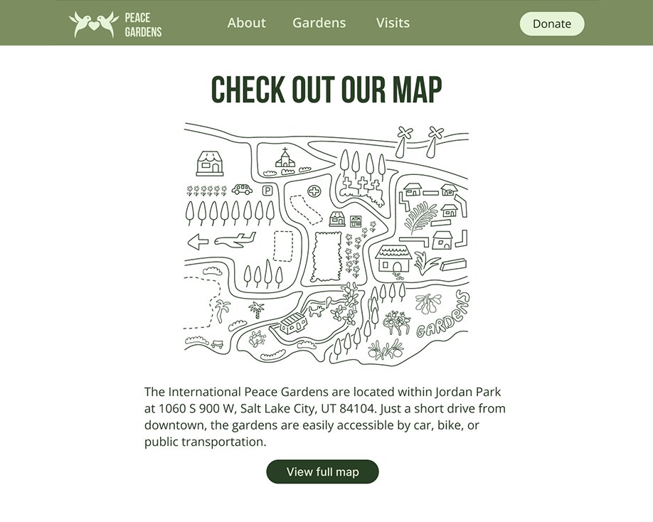
Map as hero element, logistics above the fold
About Page
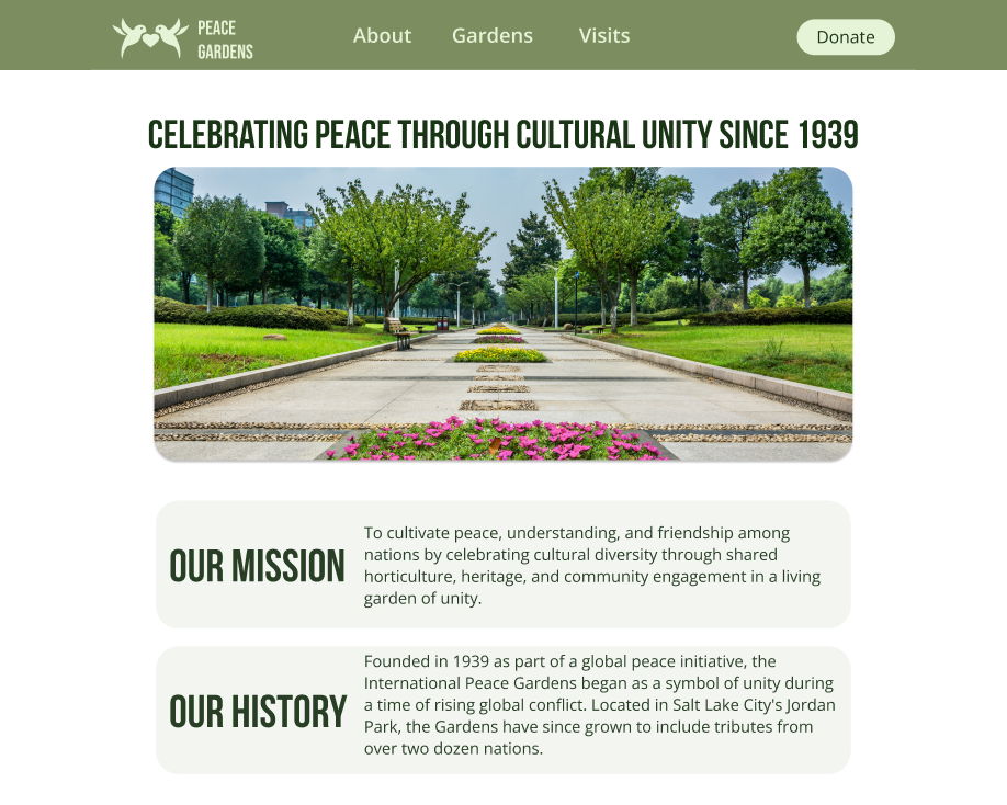
Mission and story front and center
Donate Page
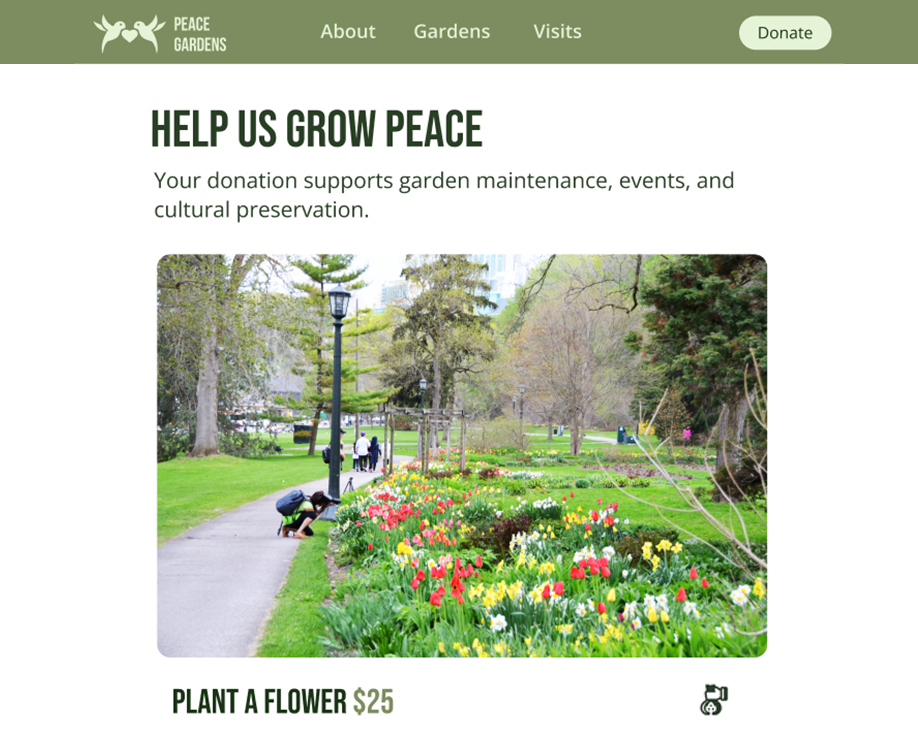
Stepped form + visible confirmation
07
USABILITY TESTING
Testing confirmed the redesign worked, and surfaced six specific things to fix.
Navigation Ambiguity
Some users weren't sure where to click first. "About" and "Visits" sections needed clearer visual distinction.
Fix → Add descriptive subtext to nav items on hover and use iconography alongside labels.
Donate Button Contrast
A few users ignored the Donate button despite it being in the nav: it needed stronger contrast or a subtle animation.
Fix → Increase button contrast ratio, add a gentle pulse on first scroll, repeat Donate CTA in footer.
Donation Form Fatigue
Testers scrolled quickly through or skipped form fields. A long single-scroll form created anxiety before users even started.
Fix → Break into a 3-step flow: Amount → Personal Info → Confirmation.
No Submission Confirmation
After submitting the donation form, users wanted confirmation before the page redirected. The abrupt redirect felt like something had gone wrong.
Fix → Add a "Processing your donation…" loader with a success state before any redirect.
Mobile Touch Targets
On small screens, some dropdowns and buttons felt cramped. Users hesitated or missed tap targets on the first attempt.
Fix → Increase all interactive elements to minimum 44×44px touch target, add more vertical padding to mobile form fields.
Missed Dedication Checkbox
Users overlooked the "Dedicate Donation" checkbox, an important feature for people donating in someone's honor.
Fix → Expand the checkbox visually when checked to reveal dedication fields inline.
08
REFLECTION & NEXT STEPS
WHAT I'D DO DIFFERENTLY
Testing with a convenience-based user pool missed a critical group: the people who volunteer, donate, and organize events. A second research round focused on the engaged community member would have sharpened the Volunteer and Donate pages considerably.
STRONGEST DECISION
Rebuilding the information architecture before touching Figma was the right call. The original problems weren't cosmetic; they were structural. Solving navigation and hierarchy first made every design decision that followed faster and more defensible.
What's next
Interactive Garden Map
An SVG map with clickable country sections and walking routes — the top-requested feature that never made it into this sprint.
Multilingual Support
A garden representing 26 nations should be navigable in more than one language. Spanish, Mandarin, and Arabic would be the starting point.
Events Calendar + Volunteer Signups
A live calendar with RSVP and volunteer registration would turn the site into a community hub, not just an information page.
E-commerce for Souvenirs + Memberships
A membership tier and gift shop would create recurring revenue and give supporters an ongoing relationship with the gardens.